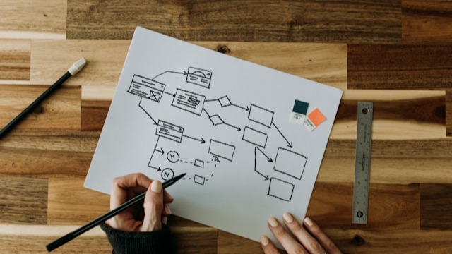
An affinity diagram is a visual tool that gathers loose ideas and organizes them by their relationship. It’s especially useful when you have fragmented information from interviews, surveys, or other sources and need to find order in the middle of chaos.
For this reason, it’s used in quality, design, UX, and collaborative workshops. In this guide you’ll see what an affinity diagram is, what it’s for, how it’s built, its advantages and disadvantages, and which tools you can use to create one.
Affinity Diagram 2025: Definition, Steps, Uses, and Example
What Is an Affinity Diagram?
It’s a visual tool that groups multiple ideas or data points into categories according to the theme, relationship, or pattern they share. It was developed in the 1960s by Japanese researcher Jiro Kawakita, which is why it’s also known as the KJ method.
Today, it’s part of the new quality management tools, used to organize scattered information and produce actionable conclusions.
Other alternative names include: affinity map or affinity diagram, and in some contexts it’s related to thematic analysis.
What Is an Affinity Diagram Used For?
An affinity map is used to organize large amounts of unstructured information, but it also covers other aspects.
So, you can say the KJ method helps to:
Make sense of a wide variety of qualitative data (interviews, surveys, comments) by transforming them into clear, actionable themes.
Detect patterns, overlaps, and frequent causes in processes, products, or user experiences.
Turn research notes or brainstorming outputs into clear thematic blocks that make it easier to extract useful conclusions.
Prioritize problems and key insights to focus the team on the highest-impact topics.
Facilitate collaborative work by visualizing all the information on a single board.
That’s why it’s commonly used in UX research, quality improvement, service design, innovation, or customer experience analysis.
Elements of an Affinity Diagram
An affinity diagram is composed of:
Individual cards or notes. Comments or findings are recorded on a sticky note (physical or digital). Generally, each contains a single brief idea so it can be moved and regrouped without confusion.
Groups or categories. Cards are assembled into sets that share a similar theme, problem, or pattern to identify what repeats.
Group labels or titles. Each group receives a short heading that summarizes the common concept (for example, “response times” or “mobile experience”).
Behind every affinity map there’s also a facilitator who explains the objective, sets time boxes, and guides the session. As a result, the quality of the diagram largely depends on how the team participates and how consensus is reached.
How to Create an Affinity Diagram Step by Step
Creating an affinity diagram step by step ensures each phase is carried out clearly and without bias.
These are the 7 steps you should follow:
Define the objective or problem. Clarify what you want to understand or solve. For example: “Identify the main reasons for the drop in customer satisfaction last quarter.”
Gather information and ideas. Collect all relevant materials: interviews, open-ended surveys, reviews, meeting notes, etc. The more varied, the more complete the theme map will be.
Write one idea per card. Transfer each comment or finding to a sticky note, using brief, clear phrases so it’s easy to read and move to the right group.
Group the cards by affinity. Place related notes together on the wall or digital board—ideally in silence to avoid bias.
Add a title to each group. Use short labels (2–4 words) that summarize the core idea of the set—for example “response times” or “mobile experience.”
Review, combine, and prioritize. Analyze the affinity map with the team and merge very similar groups. Also, relocate doubtful notes and order the themes by impact, frequency, or urgency.
Document conclusions and next steps. Close the session by clarifying decisions: what will be addressed immediately, what needs deeper research, and which tasks will be assigned to the team.
These steps are key to obtaining a clear view of what really matters and to moving forward with more informed decisions.
Practical Affinity Diagram Example
Let’s put the steps into practice…
Suppose a freelance web designer wants to understand why several clients have recently expressed frustrations. To do this, it gathers around 25 customer testimonials seeking to identify the aspects that cause friction:
Step 1. They find phrases such as:
“There weren’t enough updates.”
“The site took longer than expected.”
“The changes weren’t clearly defined.”
“On mobile some parts don’t display well.”
“The quote wasn’t fully transparent.”
Step 2. Each idea is transferred to an individual card so it can be moved during grouping.
Step 3. After a few minutes, four clear themes appear:
Unclear communication (few updates, confusing instructions).
Delivery times (delays, misaligned expectations).
Confusing pricing (questions about scope and cost variations).
Mobile experience (display issues on phones or tablets).
Step 4. Each cluster receives a short heading, and doubtful cards are adjusted to make the logic of each block clear.
Decisions:
Create a standard scope and pricing document to avoid misunderstandings.
Establish a fixed communication schedule with interim deliverables using simple tools like Google Calendar.
Include mandatory responsive testing before every final delivery.
In this example, the affinity diagram helps move from scattered testimonials to clear themes and concrete actions.
Advantages and Disadvantages of the Affinity Diagram
The KJ method is a powerful tool for working with qualitative information. However, you should know what it brings and what its limits are, since it doesn’t solve everything on its own.
Advantages of the affinity diagram
Lets you see at a glance which themes repeat and where feedback clusters.
Involves the team in interpreting data and helps build a shared view.
Fosters collaboration, since all parties can contribute ideas and participate in grouping.
Reveals patterns and relationships that aren’t visible in a list.
Is flexible and applicable in many contexts.
Serves as a foundation for subsequent analyses.
Disadvantages of the affinity diagram
Can yield different interpretations depending on who participates.
Requires dedicated time and doesn’t work well if the team is in a rush.
If information isn’t cleaned or synthesized, the board can become cluttered and lose legibility.
Although it organizes themes, you still need to analyze the results to decide what to tackle first and how to act.
With that in mind, the next step is knowing when it is—or isn’t—worth using an affinity diagram.
When Is It Worth Using an Affinity Diagram?
At this point, it is clear that you can use affinity diagrams to organize ideas. However, they are not the only tool that can be used to group information; mind maps, concept maps, and summary tables can also be useful.
So, you need to determine in which situations it’s best, and in which it’s preferable to choose other graphic organizers:
When to use an affinity diagram
When to use another tool
When you receive many comments, testimonials, or research notes and need to organize them to analyze.
If you want to discover patterns, overlaps, or recurring themes across different users or situations.
When you need a visual starting point for subsequent analyses (prioritization, defining actions, mapping, etc.).
If you have a team and want their active participation to interpret findings and synthesize scattered information.
When you need to show step-by-step processes, a flowchart will work better.
If you need to represent hierarchies or conceptual relationships, a concept map is more suitable.
If the project demands exact data, measurements, or numeric comparisons, rely on quantitative methods or statistical charts.
If you only want to summarize content to study it, an outline chart (synoptic table) is more appropriate.
Online Tools to Create Affinity Diagrams
There are all kinds of digital tools for online collaboration—including those that facilitate creating affinity diagrams and can also produce other visuals.
Notion. Lets you build boards with cards that can be grouped, reorganized, and tagged.
These tools let you move notes, reorganize groups, and document results without needing a physical board.
Conclusion
The affinity diagram is a simple yet highly effective tool for working with qualitative information. It turns scattered ideas into clear themes, supports team analysis, and yields better-grounded decisions. That’s why it’s so useful in research, design, quality, and innovation.
If—beyond organizing ideas—you’re looking for alternatives to better organize your finances, choose DolarApp. Especially if you have income from abroad and need a clear record.
Through our app, you can send, receive, convert, and manage digital dollars and euros with ease—plus a competitive exchange rate.
Frequently Asked Questions
What is an affinity diagram and what is it for?
It’s a visual tool that groups ideas or qualitative data according to a common relationship. It’s used to identify patterns, synthesize scattered information, and facilitate decisions within a project.
How do you create an affinity diagram step by step?
The first steps are to define the objective, collect ideas, write one per card, and group them by similarity. Then, assign titles to each group, review the groupings, and document conclusions.
What’s the difference between an affinity diagram and a mind map or outline chart?
The KJ method organizes ideas by their natural relationship without prior hierarchies. A mind map starts from a central concept and associations, while an outline chart summarizes information in a structured, hierarchical way.
How many people do you need to create an affinity diagram?
While you can do it alone, it works best with 3–6 people to gain varied perspectives without overloading the session—plus a facilitator to keep order and guide the process.
What software can I use to create an online affinity diagram?
Options like Miro, Figma’s FigJam, and Lucidchart allow you to create notes, move cards, and collaborate in real time. They’re ideal for remote teams or structured sessions. You can also use lighter tools such as Mural or Whimsical.

 Freelancer tips