 Freelancer tips
 Process Operations Diagram: What It Is and How to Make One
The process operations diagram helps organize tasks, improve productivity, and support better decision-making. Learn how to create one here.


A suitable color palette can make a difference in building a solid brand or any design project. A perfect combination of colors can create good impressions on clients and make you stand out in the market. That’s why a color palette generator tailored to the needs of each freelancer exists, creating harmonious and professional results.
If you’re unsure which one to use, stay with us and find out in our list of 5 tools to generate color palettes. But before we dive into the details, let’s talk a bit about the definition and importance of a color palette in the freelance world.
A color palette is a specific collection of colors used together to create a project or give personality to a brand. These palettes combine various tones, shades, and hues to create a coherent visual harmony. Designers use them to ensure that the elements of a project work together functionally and aesthetically.
The importance for freelancers lies in several aspects.
First, it allows you to convey quality and professionalism in your work. Additionally, a well-defined color palette helps you establish and maintain the brand's visual identity, which is ideal if you work in branding.
It’s also crucial for persuading clients visually, influencing their decisions. A good color palette can evoke positive emotions and associations that reinforce your brand's personality.
Finding work on Behance or another freelance platform is easier than selecting the right color palette. This decision requires much more dedication if you want to convey a clear and professional message.
Here are some recommendations:
Before looking for color palette generator tools, define what you intend to achieve with it.
Is it for a project? To send a message? What do you want to convey? Who is your target client? Consider cultural context, design type, and other aspects to ensure the palette meets the project's needs.
Colors have emotional and psychological impacts. Different colors can influence others' perceptions and feelings. Many freelancers in digital marketing use this strategy to make clients identify with a product.
For instance, stores like Victoria’s Secret automatically associate with pink and often attract female buyers. Understanding how this study works will help you determine the right colors and position yourself in your niche.
Look for trending color palettes to have a reference or source of inspiration. If you have a base color in mind, check current examples to see how they are being used. This will not only give you new ideas but also ensure your design looks modern and relevant.
Choose a color that reflects your brand's values and essence, which will dominate the palette. Add variety and depth by using complementary or contrasting tones that maintain coherence while adding dynamism to your visual identity.
Consider these points when creating a color palette to make it effective. Once you have a clear idea of how you want your palette, you can turn to online tools. Here are some of the best options.
Nowadays, there are countless sites to view color palettes, but some are better than others.
Here are our top 5 tools to generate color palettes:
First on our list is Adobe Color, a free color palette generator with a user-friendly interface for freelancers familiar with Adobe services.
With Adobe Color, you can select suitable color combinations for your brand and upload images to generate palettes based on their tones using the "Extract Theme from Image" feature.
This is very useful for maintaining visual coherence in your marketing materials. It’s ideal for freelance graphic designers to create harmonious color schemes.
Another excellent option is Color Hunt, a gallery with hundreds of pre-designed templates and modern, attractive color combinations.
The site offers easy navigation and is known as an inspiration source, especially for newcomers to the design industry.
The palettes are chosen by a community of designers, making it easier to find colors aligned with current trends. With this color palette generator, you can explore popular, recent, and random color varieties and save and share your favorites.
Coolors stands out with several features that set it apart from many other color palette generators for freelancers. First, it allows you to create gradients and custom combinations from uploaded images.
You can also explore using keywords, adjust colors, lock your favorites, and export in multiple formats (PDF, PNG, etc.). Coolors is essential if you’re experimenting and want to find the perfect color palette for your projects or brand.
This basic color palette generator features an interactive wheel for creating combinations based on color theory principles.
Paletton is perfect for graphic and web design experts looking for harmonies and selecting tones similar to their base color. It also offers a preview of palettes on simulated websites and other benefits, including generating monochromatic, adjacent, triadic, complementary color schemes, or manual adjustments to see tone changes. Like other color palette generator tools, Paletton is free for any user.
Last on our list is Canva's color palette generator, a popular platform for creating visually appealing content, whether you’re an experienced designer or not.
You can create your palette from uploaded images, customize them, and make them unique. Canva's collection includes 100 color combinations for you to choose from, aligned with your visual content. It’s characterized by its simplicity and ease of use.
Any of these 5 color palette generators are ideal for freelancers. Most are free, but some offer Pro versions, which are great if you want something more professional. Of course, you’ll need to invest money.
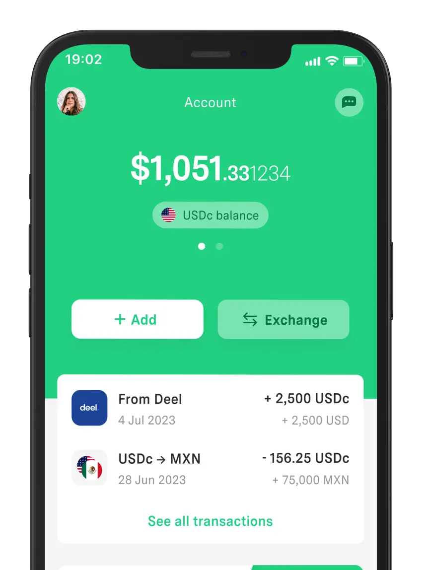
The good news is that you have DolarApp to pay for a worthwhile subscription, allowing you to enjoy more advanced features.
A group of colors that look pleasing together, available in various types:
Complementary: Two opposite colors on the wheel creating a vibrant contrast.
Analogous: Colors adjacent on the color wheel offering smooth combinations.
Triadic: Three equally spaced colors on the wheel providing a balanced and dynamic scheme.
These are 3 common terms when using a color palette generator.
Hue: Defines the base of the color without alterations, in its purest form, like red, blue, or green.
Tones: Created by adding white to a hue to form lighter colors.
Shades: Obtained by adding black to generate darker colors.
Smooth transitions between two or more colors creating a gradual effect from one color to another. Used to add depth and a visually appealing, dynamic aspect to designs.
It’s a variety of colors selected in a design that, when combined, look aesthetically pleasing. These are carefully chosen to complement and highlight the overall look of a brand or project.
It’s a tool used to facilitate the creation of harmonious and suitable color palettes, helping you choose colors that visually align with your brand or project.
Think about how you want to position your brand and choose colors that represent those qualities. Cool colors can convey trust and loyalty, while warm colors evoke enthusiasm and energy.
The world has borders. Your finances don’t have to.
 Freelancer tips
 The process operations diagram helps organize tasks, improve productivity, and support better decision-making. Learn how to create one here.

 Freelancer tips
 A business brings new challenges and decisions as it scales. Learn the stages of business growth and identify which stage you’re in.

 Freelancer tips
 A well-written privacy policy makes users trust your site more. Here are the necessary elements and a practical example to create one.
