Comparison charts are visual graphics that display information about two different aspects in rows and columns. They are very useful in the educational sector, marketing, and business to present similarities or differences and make faster decisions.
Although we’ve already talked about how to make comparison charts, in this post we go a little further. Today we bring you 5 online platforms you can use to simplify the process and save time. Plus, we’ll share some tips to help you choose the most suitable one for your profile.
Top 5 Platforms to Create Comparison Charts Online
1. Canva
When it comes to online design platforms, Canva is one of the most outstanding due to its accessibility.
But why else should you use Canva to make comparison charts?
It comes with grids and visual elements to organize information.
You can choose from plenty of templates that are fully customizable.
It offers multiple AI features to create comparison charts faster.
The learning curve is minimal.
With Canva it’s very easy to organize whatever you need to compare. Even if you’re using the web tool as a concept map creator, since its templates are well-structured to showcase your ideas.
2. Visme
Visme is known for transforming data and ideas into high-impact visual formats. Therefore, it allows you to create a much more dynamic comparative table than usual.
Here are some reasons to use Visme:
Advanced online editor for a professional finish.
A wide gallery of templates adapted to different styles.
Options to animate comparison charts and make them interactive.
Ability to connect files from Google Drive and OneDrive to work directly with your data.
It’s an alternative that lets you present clear results in a different way.
3. Miro
Another application that makes designing comparison charts easier is Miro. Even more so if you need to shape projects together in real time.
What does Miro offer for making comparison charts?
Tools to organize information in columns, rows, and clear layouts.
Ready-made templates for creating comparison charts.
Shared boards to work with multiple people at the same time.
The option to present the chart directly within the board, without needing to export.
Miro works as an online digital whiteboard that simplifies the structuring of collaborative ideas.
Its editor is simple, making it easy to highlight differences and similarities.
Lets you change colors, fonts, and styles to maintain your brand’s visual identity.
Offers export and sharing options.
You can create a clean and professional-looking comparison chart without spending too much time.
Piktochart’s focus on visual communication makes it very useful for comparison charts and graphic organizers. Perfect for both individual projects and professional presentations.
5. MyMap.ai (with AI)
Not all platforms come with built-in AI like MyMap.ai, an innovative application to create comparison charts instantly.
Main reasons to choose MyMap.ai:
Integrates real-time web searches.
Generates charts in seconds based on the criteria you want to compare.
Allows you to convert text, notes, or URLs.
Supports real-time collaboration.
The platform stands out for its speed and accuracy, and it also allows you to create mind maps and presentations with AI.
Although these aren’t the only platforms for creating comparison charts online, these 5 are among the most versatile. However, each one meets different needs, so you should carefully evaluate which to choose.
Tips for Choosing the Right Platform
Choosing between several platforms for creating comparison charts isn’t that simple when they all offer great benefits. What’s important here is that the platform:
Fits your level of experience.
Matches the type of project you need.
Aligns with the amount of time you want to invest.
Still, here are some ideas to help you choose between the 5 platforms for creating comparison charts:
If you just need a simple tool that communicates points clearly, Piktochart may be enough.
Canva is the most practical option for manual editing thanks to its easy-to-customize templates. Especially if you don’t know much about graphic design and want to try similar formats like synoptic charts.
Miro is a viable alternative for real-time collaboration, as it allows everyone involved to participate at once.
With MyMap.ai, you can leverage artificial intelligence to create charts in seconds. Ideal if you don’t have the information ready and need to generate a comparison immediately.
Visme helps you add more visual dynamism to your designs and lets you display them interactively. It’s the most suitable of the 5 for creating interactive comparison charts.
It’s also important to consider that the features of each platform vary depending on the plan you use.
Comparison Chart of the 5 Platforms to Create Comparison Charts
Tool
Main Strengths
Ideal for…
Canva
Pre-designed templates.
Quickly creating comparison charts without prior design experience.
Visme
Animations, interactive elements, and data integration.
Professional and dynamic comparison charts.
Miro
Real-time editing.
Organizing and comparing ideas collaboratively.
Piktochart
Visual communication-focused templates and style customization.
Designing simple, clear charts aligned with brand identity.
MyMap.ai
Transforms ideas into visual charts from text.
Generating charts in seconds with AI support.
Conclusion
Comparison charts are one of the clearest ways to simplify data using rows and columns. But everything is easier when using tools designed for this type of visual resource.
Canva, Visme, Miro, Piktochart, and MyMap.ai each bring different value when it comes to design. Some are more useful for inexperienced users, while others offer collaborative functions or are AI-powered.
The good news is that all of them serve as support for presenting understandable and visually appealing comparisons. You just need to choose the one that best fits your goals, whether for a freelance project, academic work, or personal use.
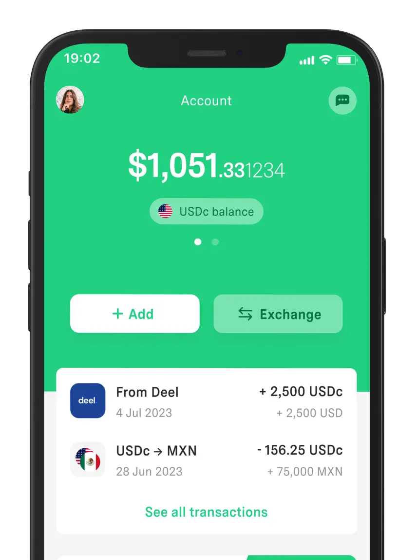
Meanwhile, DolarApp is your perfect ally if you need an alternative to manage digital dollars or digital euros. Available to give you access to USDc and EURc through a simple process.
Our app is an alternative for freelancers or anyone needing a digital solution. Not only to send or receive USDc/EURc but also to exchange currencies with a competitive exchange rate.
Frequently Asked Questions
Are the tools to create comparison charts free?
Yes, most of them offer free plans that let you create basic comparison charts. However, more advanced features, such as animations or team collaboration, are usually only available on paid plans depending on the platform.
What’s the size or row/column limit?
It depends on the tool. Canva and Visme don’t set limits, just design dimensions. MyMap.ai and Piktochart also don’t specify, but Piktochart suggests 5 to 10 rows. Meanwhile, Miro supports up to 1,000 rows and 50 columns.
Can comparison charts be exported in PDF or image?
Yes, all the platforms mentioned in this post allow exporting in popular formats like PDF, PNG, or JPG. The quality and variety of formats depend on each one or the chosen plan.
Can I use these platforms offline?
In general, no, since they are designed to work online. However, Canva and Piktochart allow downloads in PDF, PNG, or PowerPoint to use offline. Canva even has an app with an offline mode that syncs afterward.
Discover a world without borders.
The world has borders. Your finances don’t have to.

 Freelancer tips