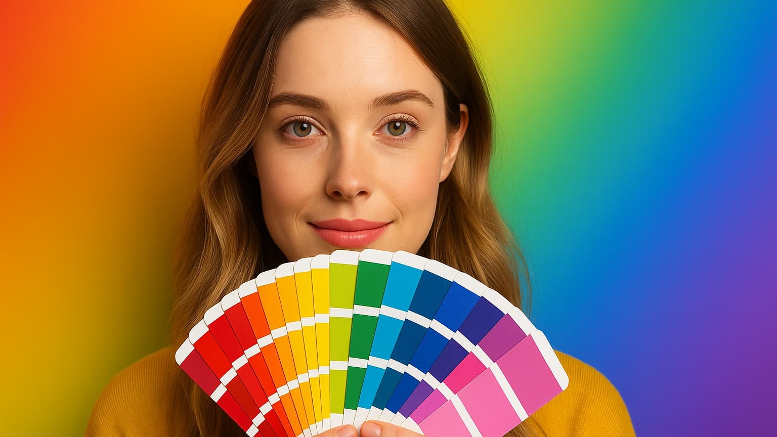
Color psychology is an area of study that analyzes the relationship between colors and emotions. Its importance lies in the fact that a color can trigger internal effects (positive or negative) that influence our behavior and decisions.
That’s why color psychology is used in fields such as design, advertising, and marketing. Applied well, it reinforces a brand’s message, attracts a specific audience, and improves the impact of its campaigns.
So if that’s what you’re looking for, stick around and learn more about this field of study—from the meaning of colors and their classification to how to choose effective palettes.
Color Psychology 2025: Meanings, Effects, and Applications
What is color psychology?
It’s a branch of psychology that studies how colors influence our emotions, perceptions, and decisions. It’s grounded in a biological approach, where certain colors provoke immediate physical responses in the body.
For example, a study on academia.edu indicates that colors like gray evoke negative emotions such as sadness, while green tones convey calm.
But it also relies on cultural factors, which influence how each society interprets and assigns meaning to those colors. As in some Western countries, where white symbolizes purity, while in some Asian cultures it can be associated with mourning.
You could say there is no universal rule, since its impact depends on context, culture, and personal experience.
Warm vs. cool colors: What are their general effects?
Many professionals and freelancers in graphic design, marketing, or architecture apply color psychology to convey specific emotions. To do so, they consider warm and cool colors:
Warm colors
Warm colors create a sense of closeness and are associated with dynamism, energy, fun, passion, or happiness. In some contexts, they project a sense of urgency.
Examples of warm colors:
🟡 Yellow.
🟠 Orange.
🔴 Red.
Hence the use of red on discount labels or promotions to capture the public’s immediate attention.
Cool colors
These are tones that generate calm, reflection, trust, relaxation, well-being, and, in turn, nostalgia, distance, or sadness.
Examples of cool colors:
🔵 Blue.
🟢 Green.
🟣 Purple.
That’s why green, for example, appears in brands like Starbucks (symbolizing freshness) or in eco-friendly products.
What do colors mean?
It’s no coincidence that many financial institutions choose blue for their logos, like BBVA or Chase. There’s a reason for this.
The meanings of colors in marketing are usually those you’ll see below:
Color
Meaning
Associated emotion
Example use
🔴 Red
Passion, energy, urgency, warning.
Intensity
Offers, CTAs
🟡 Yellow
Optimism, attention, vitality.
Happiness
Signage, moderate accents
🟠 Orange
Enthusiasm, creativity, friendliness, dynamism.
Fun
Friendly CTA buttons
🟢 Green
Health, nature, balance, growth.
Hope
Wellness, finance
🔵 Blue
Trust, security, stability, professionalism.
Calm
Banking, technology
🟣 Purple
Luxury, creativity, mystery, spirituality.
Inspiration
Beauty, premium brands
⚫ Black
Elegance, authority, sophistication, power.
Sobriety
Fashion, high-end
⚪ White
Purity, simplicity, spaciousness, cleanliness.
Clarity
Healthcare, minimalism
🌫️ Gray
Neutrality, formality, sobriety, balance.
Seriousness
Corporate image
Each color tends to elicit specific emotions in people, which explains the use of color psychology in branding.
How to choose and apply color palettes?
The process of choosing a palette brings together three factors: strategy, aesthetics, and accessibility. To do this:
Define the emotional objective and the audience you’re targeting.
Select a color scheme on the color wheel.
Establish visual hierarchy with balanced proportions.
Verify accessibility and contrast across all elements.
Run A/B tests and maintain consistency across channels.
Let’s break it down:
Emotional objective and audience
Remember that color psychology can be interpreted differently depending on context, so:
Note the segment and culture (age, location, cultural references).
Review cultural connotations.
List 3 keywords to guide your palette (e.g., trust, stability, clarity).
Color scheme (complementary/analogous combinations)
Next, apply that decision in a balanced color scheme; the color wheel gives you several options:
Complementary. Use a base color and its opposite to create strong, striking contrasts—ideal for CTAs or promotions.
Analogous. Take the base color and its neighbors (e.g., green, blue-green, and blue) to deliver harmony and visual continuity.
Triadic. Allow you to balance contrast and cohesion.
Visual hierarchy
There’s a simple formula to organize your palette and prevent colors from competing with each other. Assign proportions to each role within a design:
60%: primary brand color, applied to backgrounds or large surfaces.
30%: secondary colors, adding variety and balance.
10%: accent color, for buttons, links, or calls to action.
Accessibility
Ensure sufficient contrast between text, buttons, and backgrounds, following WCAG (Web Content Accessibility Guidelines), for example:
Minimum contrast 4.5:1: for body text.
Minimum contrast 3:1: for large headings (≥18 pt bold or ≥24 pt).
Interactive elements (buttons, links, icons): must also meet these contrast ratios to be legible and accessible.
A/B testing
Finally, test color variants on key elements.
How to do it?
Prioritize tests on: CTA color, links, and backgrounds.
Change a single variable per test (e.g., blue CTA vs. green).
Measure results: CTR, conversions, or time on page.
Consistency: document the palette and apply it across web, social, and print assets.
By applying color psychology, you can go from a simple design that merely informs to one that truly connects with your audience.
Practical applications of color psychology
Applying color psychology helps amplify a message and elicit the desired reaction from the audience. But this varies by field:
Several tools can help you apply color psychology in your projects:
Color wheel. Used to explore combinations based on color theory; options like Canva or Adobe Color let you try them interactively.
Palette generators. Create automatic combinations from a base hue or image without losing visual coherence.
Contrast checkers. Sites like WebAIM or Contrast Ratio ensure your colors are legible and accessible for all users according to WCAG.
You could also visit inspiration sites like Behance or Pinterest. There you can see real examples of designers applying color psychology in logos, interfaces, or spaces.
Conclusion
The study of color psychology suggests that each color functions as a visual language. It’s not just about aesthetics, but about how it can influence our emotions and perceptions—although interpretation often varies by cultural context and the environment in which it’s used.
Whether you want to design a brand campaign or creative infographics about finance, you should consider these factors. As well as test your color palette across different formats and ensure it’s accessible.
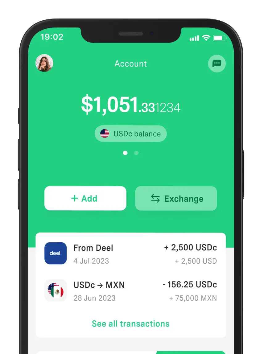
Now, looking for a secure experience to manage your finances? We recommend using DolarApp. We offer access to digital dollars and euros (USDc/EURc) and currency conversions at a fair exchange rate—
ll from a digital account you can set up quickly from your mobile device.
Frequently Asked Questions
Is color meaning universal?
No. The meaning of colors is influenced by several factors such as culture, personal experience, or context. Therefore, it’s always wise to research the target audience before defining a palette.
Which color converts best for a CTA?
There isn’t a single color that always works, but one of the most popular is red, as it stimulates quick decision-making. However, CTAs usually stand out most when they contrast with the rest of the palette.
How do you adapt colors to different countries?
The key is to understand cultural connotations and adjust the palette to the local market to avoid misinterpretations. Green, for example, symbolizes hope in the West but shame in China.
How do you ensure legibility and contrast?
Use contrast checkers to comply with WCAG guidelines. This is the most common way to ensure content is clear and accessible across different devices and vision conditions.
 Freelancer tips