A landing page is a page designed to turn visits into results, such as signups, sales, or downloads. In other words, it’s where your campaigns stop being just clicks and turn into real contacts (leads).
That’s why it’s so important for businesses, freelancers, and entrepreneurs who are looking for more than just traffic: they want opportunities and potential clients. But if you want it to succeed, you need to know the key elements, the types of landing pages that exist, and how to create one.
And in this article, we’ll walk you through all of that and also share some examples to inspire you. Let’s get started.
Landing Page: What It Is, What It’s For, Types, and How to Create One
What Is a Landing Page?
It’s a web page designed to turn visitors into leads or customers through a specific action. That action could be signing up, buying, or downloading a resource—without distractions or unnecessary links.
The landing page focuses all the attention on a single goal: getting the user to take action. Unlike a traditional website, which spreads its content across multiple purposes and audiences.
A clear example is when you enter a website and they invite you to leave your email to access an exclusive offer. The landing page is where that action happens when you enter your email.
It’s also known as a landing page, conversion page, or destination page.
What Is a Landing Page For?
Simply put, a landing page is used to guide the visitor toward a specific goal and measure how effective the strategy was.
In general, it’s used to:
Generate conversions. That is, turning a mere visit into a signup, a product/service purchase, or a subscription.
Promote products or services. It lets you highlight specific campaigns, launches, or discounts, providing clear information and a direct button to turn interest into action.
Measure results. It helps you evaluate the performance of each campaign and understand which messages or designs generate more responses, since it’s connected to analytics tools.
Segment audiences. It collects key data about visitors (age, interests, etc.), which helps you create more personalized and effective strategies for future marketing actions.
Optimize ad campaigns. It lets you test different ads, copy, or images to identify which ones deliver a better return on investment and improve overall performance.
So we can say it’s a strategic tool to attract, convert, and better understand your audience.
Key Elements of an Effective Landing Page
Content and strategy are just as important as landing page design to grab the user’s attention and guide them where you want them to go.
The basic elements include:
Clear, compelling headline that communicates the main value in seconds. Like the ones you see on design platforms such as Visme, with messages like “Create anything.” They’re short but powerful phrases that convey freedom and accessibility.
Concrete benefits that explain what the user gains by completing the action. This is more persuasive than just describing the product or service.
Visible call to action (CTA) that motivates the visitor to take action, like “Download now,” “Get your free trial,” or “Sign up.”
Supporting image or video that reinforces the message and builds trust. Visual content helps users picture what they’ll get—especially on platforms like Visme or Canva, where design is part of the main value.
Simple, trustworthy form to get more signups. Asking only for the necessary information builds trust and reduces friction in the conversion process.
It’s worth noting that the elements work together to maintain attention and make action easier. When they’re well structured, you can attract clicks and turn interest into real results.
Types of Landing Page
Each landing page serves a different purpose depending on the type of action you want from the user.
Below are the main types and how they work:
Lead capture landing page. Designed to collect contact information (e.g., name or email) in exchange for a resource or valuable content.
Direct sales landing page. As you’d imagine, the goal is to close a purchase on the spot. It showcases the product, highlights its benefits, and guides you toward the payment or subscription button.
Download landing page. These pages give access to ebooks, guides, or free tools. They work well when you offer valuable content in exchange for user data.
Registration landing page. Used for events, webinars, or launches with the aim of getting quick, simple registrations. Google Meet, for example, uses this type of page to promote signups for its virtual sessions.
So choosing the right type of landing page depends on the goal of your campaign. The most important thing is that each one keeps a single focus, avoids distractions, and is optimized to encourage the user to take action.
Examples of Successful Landing Pages
The most effective landing pages have something in common: they communicate value immediately and remove friction from the conversion process. And the best way to understand this is by illustrating different successful approaches.
Landing page examples:
1. Financing and upgrade program (Be Samsung)
A popular example is Samsung, which uses a landing page to showcase its Be Samsung program. Its design is intended to help the user quickly understand how much they would pay per month and to keep the purchase button always in view.
On this type of conversion page, the following stand out:
Short, direct headline that presents the program as an invitation to join (“join” / “get your Galaxy…”).
Supporting message that explains it’s an exclusive financing plan with affordable monthly payments.
Image of the phone model they want to promote.
Visible price block with the monthly amount, number of months, and a note clarifying that it’s interest-free with the partner bank.
Main CTA in high-contrast buttons such as “Learn more” or “Buy now.”
2. Free Guide Download or Online Course (Domestika)
Domestika uses highly visual landing pages to promote each course. In this example, you can see how they structure the information to lead the user to purchase.
On the page, you’ll see:
A descriptive and specific title that clearly states what the course is about.
A benefit-focused subtitle explaining what the student will learn.
Social proof, with number of students, ratings, and satisfaction percentage.
Offer and price displayed prominently, showing the discount.
A primary CTA “Buy,” in a prominent button that invites users to complete the purchase immediately.
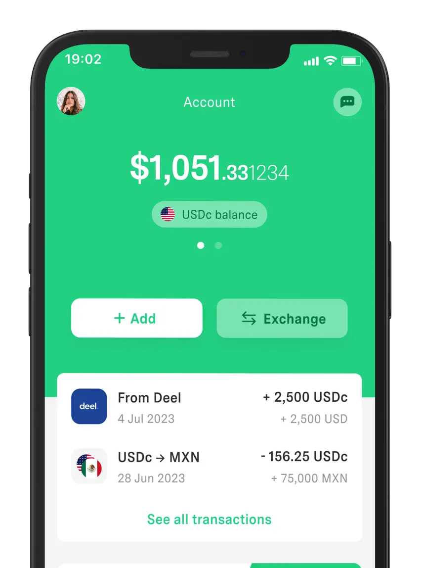
3. Fintech or Digital App (DolarApp)
The DolarApp landing page is designed to convince and register new users from the very first scroll.
Among its standout elements:
A strong, emotional headline that sums up the problem and the promise in a single sentence: “Countries have borders. Your finances don’t anymore.”
Benefits in a “Say goodbye to…” format, explaining what it solves without getting technical.
Blocks of concrete benefits, each paired with a CTA like “Convert now.”
Social proof and trust, including real-time data, user ratings, and mentions in specialized media.
A main CTA “Sign up,” visible in the top-right corner with a green button that contrasts against the dark background.
As you can see, there’s no single formula, but there is a pattern. With a clear message, visible benefits, and a prominent call to action, a visit turns into a signup, download, subscription, or sale.
How to Create a Landing Page Step by Step
A landing page requires placing each element in the right order. To do this, you can follow a few steps:
Define a specific goal. Decide whether you want to get signups, sell a product, promote a webinar, or capture leads for a service.
Create the visual and written content. Write a clear main headline, a subtitle that explains the benefit, and a short text that answers “What do I gain if I click here?”
Add the action button or form. Choose a form based on your goal, keep it as simple as possible, and use action-oriented button text like “Sign up now,” “Download guide,” or “Try for free.”
Optimize for SEO and mobile devices. Include your main keyword in the title, a subheading, and naturally throughout the text. Also optimize copy and structure to increase your conversion rate. Then, check that the page looks good on mobile.
Measure results and make adjustments. Connect the landing page to an analytics tool like Google Analytics to see how many visits you get, how many convert, and from which channels.
If you work remotely, coordinate with your team using Google Workspace to edit copy, share assets, and keep everything centralized.
Conclusion
The landing page is a fundamental piece of digital marketing. It lets you turn clicks into signups, sales, or information requests, with clear data on what works and what doesn’t.
When you choose the right type, carefully design the elements, and measure results, the page stops being static—and you can really move the needle. A good landing page, supported by remote work tools, can turn your online efforts into real business opportunities.
Meanwhile, DolarApp turns your transactions into simple and secure financial experiences. Download it and start sending/receiving digital dollars or euros for a standard fee of 3 USDc/EURc.
You can also take advantage of a competitive exchange rate for buying and selling currencies.
Frequently Asked Questions
What is a landing page and what is it for?
It’s a page created with the goal of capturing leads or selling a product/service. It’s used to direct the user toward a specific action and measure how many visits turn into results.
What’s the difference between a landing page and a website?
The landing page focuses on a single action and removes distractions, while a traditional website usually has multiple sections, links, and goals—for example, informing users about the brand.
What should a good landing page include?
To be effective, it should include a clear headline, concrete benefits, a supporting image or video, and a simple form. Plus a visible call to action that drives conversion.
How do you create an effective landing page?
First, define a goal, write a clear message, highlight the benefits, and use a strong CTA. You should also simplify the form and analyze the results to keep improving conversion.


 Freelancer tips